
In this tutorial, you will learn how to create your first simple React web app using TypeScript. You will learn how to set up the project, what all the parts are, and how to add components and some interactive elements.
I wrote this tutorial as a basic foundation to help you on your way before you dive into bigger tutorials. We will go through each file and explain its purpose. By the end of this guide, you’ll have a solid understanding of how React is set up.
In this tutorial
This tutorial covers these basic concepts:
- Components: building blocks for a React app. Usually self-contained code plus UI that can be included in other pages or components like a HTML element.
- Component properties: a way to make components more dynamic by accepting input and ways to give output.
- Event handlers:
- Hooks: these are special functions that let you “hook into” React features like state and lifecycle features from function components.
Contents
- 1 In this tutorial
- 2 Prerequisites
- 3 What is TypeScript?
- 4 What is React?
- 5 Set up your first React Web App
- 6 React project structure
- 7 src directory
- 8 Main components of the application
- 9 Your first react web app: Secret message encode/decoder
- 10 Creating a message encoder component
- 11 Use useEffect to react to changing values
- 12 Get a reference to an element with useRef
- 13 Conclusion
Prerequisites
Make sure that you have Node.js and related tools installed. I recommend installing node version manager: How to install node version manager (nvm).
Other than that it is important to have an enthusiasm and interest for learning frontend web development.
What is TypeScript?
TypeScript, a superset of JavaScript. In other words, TypeScript enhances JavaScript and adds extra features to it. TypeScript brings type safety to your code. It adds static typing to JavaScript. Without a doubt, it helps you catch errors early and makes your codebase more maintainable and understandable. The compiler turns TypeScript into plain JavaScript before it runs in a browser or on a server.
The files used for TypeScript have the extension .ts or tsx. In the case of .tsx these are files that contain JSX code. JSX stands for JavaScript XML. It’s a syntax extension for JavaScript, commonly used with React to describe what the UI should look like. JSX allows you to write HTML-like code in your JavaScript/TypeScript files, which makes it easier to create and manage UI components in a more readable and expressive way.
You will use TypeScript in this tutorial to create your first React Web App.
What is React?
React, developed by Facebook, is one of the most popular JavaScript libraries for building interactive user interfaces. Furthermore, its efficiency and flexibility make it a top choice among developers worldwide. With React, you can create dynamic web applications that offer seamless user experiences.
Here is the official React website.
React components
One of the most important concepts to know before you create your first React Web App is React’s components.
React components are the building blocks of any React application. They are JavaScript functions or classes that accept inputs, called “props,” and return React elements that describe what should appear on the screen. Components allow you to split the UI into independent, reusable pieces, and think about each piece in isolation.
In a later section, you will learn how to write your own component.
Functional Components
Functional components are components declared as functions. Because of this, they can be written much more concisely than a class component. As a result, your code base can become more readable.
- Also known as Stateless components.
- They are JavaScript functions that return JSX (a syntax that resembles HTML).
- They can accept props and return React elements.
- With the introduction of React Hooks, they can now manage state and side-effects.
Example of a component declared as a function:
function Welcome() {
  return <h1>Hello, world</h1>;
}
Class Components
- More traditional React components defined by ES6 classes.
- They can hold and manage local state and lifecycle methods.
- Class components are more verbose compared to functional components.
Example of a component declared as a class:
class Welcome extends React.Component {
  render() {
    return <h1>Hello, world</h1>;
  }
}
React component properties
In React, component properties, commonly referred to as “props,” play a crucial role in creating dynamic and reusable components. Props are to components what arguments are to functions: they allow you to pass data from one component to another, particularly from parent to child components. Understanding props is essential in mastering React, as they are fundamental to component interaction and the overall component architecture.
function Welcome(props) {
  return <h1>Hello, {props.name}</h1>;
}

// Usage
<Welcome name="Alice" />
React hooks
React hooks are a very important concept in the React framework. Hooks allow you to handle events and data state in functional components. Previously state and other React features were only accessible in class components.
Here are some hooks that are used often:
useState: lets you add React state to function components. This is for getting and setting values of variables and updating HTML elements to reflect the change in value.useEffect: lets you perform side effects in function components. The code in auseEffectfunction is executed when a component has loaded, or can react to when a variable value changes etc.useRef: is a hook in React that returns a mutable ref object whose.currentproperty is initialized to the passed argument. The returned object will persist for the full lifetime of the component. This can be used to reference an HTML element as an object.useRefcan also be used to keep track of things like timers since data stored with it is preserved across renders of HTML.useContext: this hook simplifies the way you handle shared state across your application, especially when it comes to passing down props through many layers of components.
Set up your first React Web App
In this section, you will set up your first project directory and files. This is relatively easy if you use helpful tooling like npx and the create-react-app utility. You will also learn about the file structure of your project. Because the package create-react-app utility will create a lot of files it might be overwhelming and confusing at first.
create-react-app is a command-line utility that helps you create your first React Web App quickly and easily. As a result, you can start building your web application without worrying about the complexities of initial setup and configuration. Even after you create your first React Web App with this tool you can use it for other projects of course. In fact, it is recommended to do so.
Installing required and helpful tools
First, make sure that you have all the tools we will use installed. The easiest way to install node is with node version manager (nvm): How to install node version manager (nvm).
Node version manager will be helpful in the future when working with other web frontend-related projects. Certainly, it is useful when you create your first React web app.
Create the project with npx and create-react-app
Now you will create the React project using npx and create-react-app. npx is a tool that comes with npm (Node Package Manager), which is part of Node.js, and runs packages without the need to install them globally on your computer.
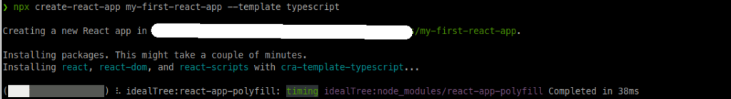
Open a command prompt or terminal and enter the following command:
npx create-react-app my-first-react-app --template typescript
npx: This is a tool that comes with npm (Node Package Manager), which is part of Node.js.create-react-app: It’s a tool to set up a new React application as mentioned before.my-first-react-app: This part of the command specifies the name of the new folder where your React project will be created. In this case, the project’s name will be “my-first-react-app”. However, you can choose any name you like for your project.--template typescript: This part of the command tellscreate-react-appto set up your new React project with a TypeScript template. Your new React project will be configured to use TypeScript right from the start.
The first time you run this command you will see a question Need to install the following packages... Ok to proceed?:

Type y and press enter. Then you will see something similar to:
After the process is complete it will look like:
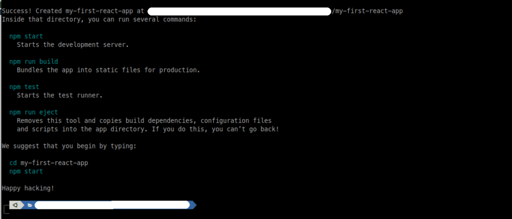
In the next section, we will look at the project files and directories this create-react-app command has created.
But before we look at the file let’s run the project and see what this template project looks like in the browser.
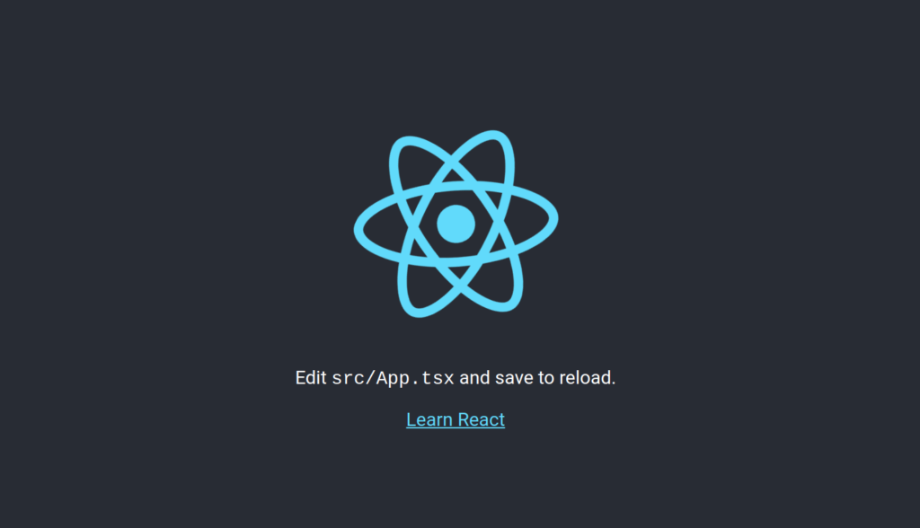
Make sure to change the directory to the directory of the project in the command prompt by using the command cd my-first-react-app. Then run the command: npm start to compile the application and start a development server that runs the application.
Your browser should automatically open and show the application. If it doesn’t happen automatically, open a browser and enter the following address http://localhost:3000 in the address bar.
You should see this page:
React project structure
Open the project directory in your favorite code editor. For example, Visual Studio Code also known as VSCode. If you have VSCode installed you can go to the directory for the project with cd my-first-react-app and then use the following command to open VSCode in the project’s directory code . (the dot “.” at the end there means “the current directory”.
It should look something like this:
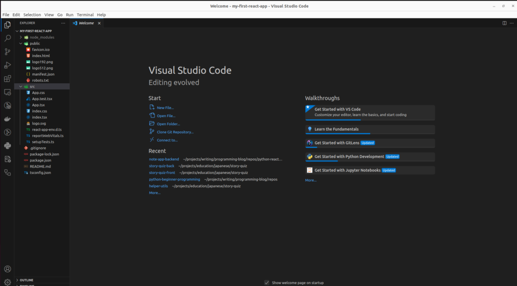
On the left of the screenshot, the files and directories are shown. Note that some of the directories might be folded and are not showing their contents when you first open VSCode:
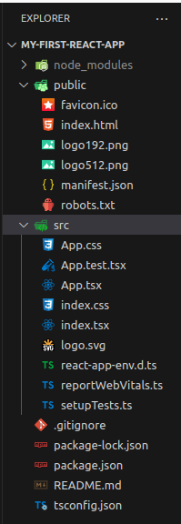
Directory structure
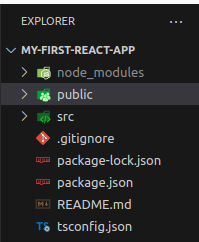
Let’s look at the directory structure. There are 4 main directories:
- my-first-react-app: main project directory containing 3 subdirectories and configuration files.
- node_modules: npm installs all packages in here.
- src: this directory contains all the files and directories that make up your application. The source files.
Next, let’s look at the directories and their files one by one.
My-first-react-app directory: files
This main project directory typically contains project directories and configuration-related files. Namely:
.gitignore
The .gitignore file in a React project is used by Git a version control system. Version control systems keep track of changes to your project and allow you to go back in history.
Git uses .gitignore to determine which files and directories to ignore in version control. This includes commonly excluded items like node_modules/, build directories (build/ or dist/), environment files (.env), and other temporary or local files. As a result, it helps keep the repository clean, secure, and efficient by preventing Git from tracking and uploading unnecessary, sensitive, or large files.
No need to worry about version control right now.
package.json
This file is like the recipe for your project. In fact, the purpose of this file is to set up and manage your application. It also facilitates sharing your project with others, as it defines all dependencies and scripts needed to use your project.
package.json contains essential information about your project. It contains the project’s name, version, description, author, and more. This meta-data is used when you publish your package for example.
There are also scripts in this file. Common Scripts in React Projects:
start: Runs your development server. In a React app, this usually launches the app in a local server for development purposes.build: Builds your application for production. This compiles your React code into static files that can be deployed on a server.test: Runs tests set up in your project. In React, this often involves running unit or integration tests.eject: Specific to create-react-app, this script removes the single build dependency, giving you full control over the webpack configuration.
You run these scripts using npm or yarn. For example, running npm start in your terminal will execute the command defined under start in your package.json. You can also add your own scripts. For example, if you want to do other things like linting, or deploying your application.
package-lock.json
This file contains a snapshot of your project’s dependencies. It records the exact version of each package that is installed when you last ran npm install. package-lock.json details the entire dependency tree (so dependencies of dependencies etc.). As a result, the consistency of installation across different setups is ensured.
README.md
The README.md typically contains basic information about the project. What the project is about, what the purpose is. But also often how to build and run the project. The .md extension indicates that the file is written in Markdown, a lightweight markup language. Markdown files are easy to read and can be formatted with simple syntax.
Especially when sharing your project publicly it is important to provide this kind of information. People who want to use your project will want to know this kind of information.
In this case, the README.md that was created by create-react-app contains information about how the project was created and how to run the scripts in package.json.
To reiterate, a good README.md in a React project might contain the following information:
- Project Title: The name of your project.
- Description: A brief description of what your project does and its purpose.
- Installation Instructions: Steps on how to install and run your project, which is crucial for React projects where setting up the environment can be complex for beginners.
- Usage: How to use the project, including basic commands (like
npm startto start a development server). - Features: Key features or components of your project.
- Contributing: Guidelines for how others can contribute to your project (if it’s open-source).
- License: Information about the project’s license (e.g., MIT, GPL).
- Contact Information: How to reach the author or maintainers of the project.
- Acknowledgments: Credits to any third-party assets or resources used in the project.
tsconfig.json
This file specifies the root of a TypeScript project and provides configuration settings for the TypeScript compiler. It helps the TypeScript compiler understand the project structure and where to start the compilation process.
When you create your first React web app, you don’t have to think about this file at all. In fact, as a beginner, you probably don’t have to think about this configuration for a long time.
For those who are interested in what each option means:
target: Specifies the ECMAScript target version (e.g., ES5, ES6). In this case, es5 which is compatible with older browsers.lib: Specifies a list of library files to be included in the compilation. It includes DOM and ECMAScript features.allowJs:true
Allows JavaScript files to be compiled along with TypeScript files.skipLibCheck:true
Skips type checking of declaration files (.d.ts). This can speed up compilation.esModuleInterop:true
Enables compatibility with Babel, allowing the use of default imports from modules with no default export.allowSyntheticDefaultImports:true
Allows default imports from modules without a default export, as if they were ES6 modules.strict:true
Enables all strict type-checking options, enforcing stricter type-checking rules.forceConsistentCasingInFileNames:true
Ensures file names are consistent in casing, which is important in case-sensitive file systems.noFallthroughCasesInSwitch:true
Prevents fall-through behavior in switch statements, reducing potential bugs.module:"esnext"
Sets the module system for the project.esnextrefers to the latest ECMAScript module standard.moduleResolution:"node"
Specifies the module resolution strategy,nodefor Node.js-style module resolution.resolveJsonModule:true
Allows importing JSON modules.isolatedModules:true
Ensures each file can be transpiled independently, which is important for certain build tools.noEmit:true
Instructs the compiler not to output any compiled code, often used when using Babel to transpile TypeScript.jsx:"react-jsx"
Specifies the JSX code generation style.react-jsxis for newer React versions (React 17+).include:["src"]
Includes all files in thesrcdirectory for compilation. This is where your source code typically resides.
Node_modules directory
As mentioned earlier, this directory is where npm installs all the dependencies for your project. For example, React-related libraries. And each library you use often has a lot of other dependencies as well. This directory can appear “greyed out” because it is in the .gitignore list. Because the libraries that are needed for the project are listed in the package.json file it is not necessary to track the contents of the node_modules directory.
There should never be a need to touch the contents of this directory manually.
Public directory
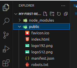
The directory called public contains static assets that are used by your application. Let’s go through the files you listed:
favicon.ico: This is the ‘favicon’ (short for ‘favorite icon’) for your website. It’s the small image you see in the tab of your browser next to your site’s title. Typically, it’s a small version of your logo or related to your site’s branding.index.html: The main HTML document of your React application,index.html, serves as the entry point, even though React builds single-page applications (SPAs). Within this file, your React components render into a div with an id, often ‘root’.logo192.pngandlogo512.png: These logo files come in different sizes and represent the default React logo for the generated application. You can remove or replace them when building your own applications. Typically, web application manifests use these logos, displaying them when users add your site to their mobile device’s home screen. The numbers in the filenames (192, 512) indicate the images’ sizes in pixels.manifest.json: is a web app manifest file. It’s a JSON file that tells the browser about your web application and how it should behave when ‘installed’ on the user’s mobile device or desktop. For example, it includes information like the name of your app, the icons (likelogo192.pngandlogo512.png), and the start URL.robots.txt: is a standard file that websites use to communicate with web crawlers and other web robots. For example, this file instructs these robots on which areas of the site they should not process or scan. It plays a crucial role in search engine optimization (SEO) by controlling which pages search engines index.
src directory
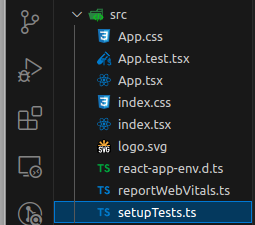
This is the directory where you will spend most of your time when you’re developing your application. It contains all the code files, markup files, and styling files.
App.css: contains the CSS styles for theAppcomponent. Write the CSS to style the layout and look of the main app component here.App.test.tsx: is a test file for theApp.tsxcomponent, where you write tests using Jest, a JavaScript testing framework. These tests ensure that theAppcomponent behaves as expected.”App.tsx: is the main React component for your application. In a React project, your UI is typically built out of components, andApp.tsxis the root component. It serves as the starting point for your React component tree.index.css: is a global stylesheet for your project. Styles you write here will apply universally across your application.index.tsx: This is the entry point for your React application. It’s where you render the root React component (App) to the DOM, usually into an HTML element with the IDroot.logo.svg: Typically, the React logo serves as the sample SVG image file in the default template for demonstration purposes. You can replace or remove it as needed.react-app-env.d.ts: It’s used to declare types for your React application and to ensure that your app is compatible with the TypeScript type definitions provided bycreate-react-app.reportWebVitals.ts: This file includes functionality to measure the performance of your app. It’s part of the default setup for reporting web vitals like largest contentful paint, first input delay, etc., which are important for understanding the real-world performance of your app.setupTests.ts: This setup file configures the Jest testing environment, running before the execution of actual tests. Moreover, it includes configurations for testing utilities like Enzyme or others.
You can ignore most of these files when you’re just beginning. Especially: App.test.tsx, logo.svg, react-app-env.d.ts, reportWebVitals.ts, setupTests.ts.
Main components of the application
In this section, you will learn about the contents of the main files that this application uses. These are important to pay attention to when you create your first React web app. Namely:
index.htmlindex.tsxindex.cssApp.tsxApp.css
index.html
This file is the main file, the template for the React application. It has the metadata, the title for your application, the body where the application code lives, etc.
<!DOCTYPE html>: This declaration defines the document to be HTML5, which is the latest standard of HTML.<html lang="en">: The opening tag for the HTML document, with a language attribute (lang="en") indicating that the content is in English.<head>Section: This section contains meta-information about the document.<meta charset="utf-8" />: Sets the character encoding to UTF-8, which includes most characters from all known human languages.<link rel="icon" href="%PUBLIC_URL%/favicon.ico" />: Links to the favicon, the small icon displayed in the browser tab.<meta name="viewport" content="width=device-width, initial-scale=1" />: Ensures your application is mobile-friendly by setting the viewport to match the device’s width and initial zoom level.<meta name="theme-color" content="#000000" />: Sets the color of the toolbar in some browsers to black (#000000).<meta name="description" content="Web site created using create-react-app" />: Provides a brief description of the website for search engines and other crawlers.<link rel="apple-touch-icon" href="%PUBLIC_URL%/logo192.png" />: Specifies an icon for Apple devices when the site is added to the home screen.<link rel="manifest" href="%PUBLIC_URL%/manifest.json" />: Links to the web app manifest, providing metadata for when the app is installed on a device.<title>React App</title>: title which appears in the browser tab.
<body>Section:- Contains the content of the HTML document.
<noscript>: Displays a message when JavaScript is not enabled in the browser, since React requires JavaScript to run..<div id="root"></div>: The main container where the React renders the application. React will attach its components inside this div. A selector operation will use theidroot to get a reference to this element and render the application there (see the next section “index.tsx”).
The href attributes often refer to %PUBLIC_URL, this is a special placeholder used in React applications. It gets replaced with the correct absolute path to the public folder of your React project when the project is built.
index.tsx
This file sets up and initializes the React application.
import React from 'react';
import ReactDOM from 'react-dom/client';
import './index.css';
import App from './App';
import reportWebVitals from './reportWebVitals';

const root = ReactDOM.createRoot(
  document.getElementById('root') as HTMLElement
);
root.render(
  <React.StrictMode>
    <App />
  </React.StrictMode>
);

// If you want to start measuring performance in your app, pass a function
// to log results (for example: reportWebVitals(console.log))
// or send to an analytics endpoint. Learn more: https://bit.ly/CRA-vitals
reportWebVitals();
The file begins with imports, where the code imports libraries and other components for use within the file. For example, the React-related libraries for initializing the React app and the App component representing the application code. Additionally, the file imports index.css which usually contains global styling that applies to the entire application.
On lines 7-9 the root element is created using a call to createRoot. This is a function from the React library. As you can see this is where the element with id root is selected from the index.html file.
Next on lines 10-14 React renders the application. The App component is rendered inside the root. The App component is the starting point for your React component tree.
Finally, on line 19 reportWebVitals() is called. This function call, by default, does nothing. However, you can pass a function to log results (like console.log) or send them to an analytics endpoint. This helps in measuring the performance of your application. However, there is no need to think about this right now.
index.css
The index.css file in a React application provides global CSS styling.
body {
  margin: 0;
  font-family: -apple-system, BlinkMacSystemFont, 'Segoe UI', 'Roboto', 'Oxygen',
    'Ubuntu', 'Cantarell', 'Fira Sans', 'Droid Sans', 'Helvetica Neue',
    sans-serif;
  -webkit-font-smoothing: antialiased;
  -moz-osx-font-smoothing: grayscale;
}

code {
  font-family: source-code-pro, Menlo, Monaco, Consolas, 'Courier New',
    monospace;
}
Here you see that there are two CSS rules defined: one for the body element and one for any code elements.
Styling for body
margin: 0;:- This rule removes the default margin from the
bodyelement, which is the standard practice to ensure consistent spacing across different browsers.
- This rule removes the default margin from the
font-family: -apple-system, BlinkMacSystemFont,m 'Segoe UI', 'Roboto', 'Oxygen', 'Ubuntu', 'Cantarell', 'Fira Sans', 'Droid Sans', 'Helvetica Neue', sans-serif;:- This sets the default font family for the entire website.
- It’s a list of font names, and the browser will use the first one it supports.
- The list includes a variety of common system fonts to cover different operating systems and preferences, ending with a generic
sans-serifas a fallback.
-webkit-font-smoothing: antialiased;:- This rule is for WebKit-based browsers (like Chrome and Safari) to improve the rendering of fonts, making them look smoother and cleaner.
-moz-osx-font-smoothing: grayscale;:- This is similar to the
-webkit-font-smoothingbut specifically for Firefox on macOS, enhancing the text rendering for a better visual appearance.
- This is similar to the
Styling for code
font-family: source-code-pro, Menlo, Monaco, Consolas, 'Courier New', monospace;:- This sets the font family for elements that are styled as
code, typically used for displaying code snippets. - It prioritizes fonts that are commonly used for code, like
MonacoandConsolas, and falls back tomonospaceas a default. Developers prefer Monospace fonts for code because they allocate the same amount of horizontal space to each character, making the text easier to read and align.
- This sets the font family for elements that are styled as
App.tsx
The App.tsx file is essentially the heart of your React application. It’s the top-level component that gets rendered into the DOM, usually inside the root div in index.html. In fact, it acts as a container for all other components and content you’ll create in your application. As a result App.tsx is typically used to define the main structure and layout of the application. This is often the first file you make changes to when you create your first React web app.
import React from 'react';
import logo from './logo.svg';
import './App.css';

function App() {
  return (
    <div className="App">
      <header className="App-header">
        <img src={logo} className="App-logo" alt="logo" />
        <p>
          Edit <code>src/App.tsx</code> and save to reload.
        </p>
        <a
          className="App-link"
          href="https://reactjs.org"
          target="_blank"
          rel="noopener noreferrer"
        >
          Learn React
        </a>
      </header>
    </div>
  );
}

export default App;
Import Statements
As always, at the top, you can see the import statements. Here the required components and libraries are imported.
import React from 'react';: This imports the React library, enabling the use of JSX and React features in the file.import logo from './logo.svg';: This imports an SVG logo from the filelogo.svglocated in the same directory. It allows the image to be used in this component.import './App.css';: import the CSS file specific to the App component, it provides styles that are applied to this component.
The App Component
The line function App() { ... } in the App.tsx file defines the App component using a JavaScript function. In React, we know this as a functional component.
Functional Component
In this case, the App is declared like any regular JavaScript function. The name App follows the convention of capitalizing React component names.
A React Component represents a piece of the UI. The App component, in this case, represents the root component that usually encompasses the entire application’s UI.
A functional component must return JSX (a syntax extension for JavaScript, which allows you to write HTML-like code) or null. In the App function, the JSX code defines what will be rendered to the DOM (Document Object Model) by this component.
JSX in the Return Statement
As mentioned, the component must return JSX. Here the layout of the UI elements is defined.
Only one top-level HTML tag is allowed. It serves as the container for the entire App component. In this case, on line 7, there is a div with className=App. The classname does not have to be App. In fact, it can be anything you want.
Inside the div there are a few basic HTML elements that make up the main page of this application. We will change this HTML in a future section of the tutorial.
<header className="App-header">...</header>:- creates a
<header>HTML element with a class nameApp-header. Used to define a heading section.
- creates a
<img src={logo} className="App-logo" alt="logo" />:- This is an image element (
<img>) displaying the logo. src={logo}: Thesrcattribute is set tologo, which is imported at the top of the file. This is the path to the image file.className="App-logo": Applies CSS styles specific to the logo.alt="logo": Provides alternative text for the image, useful for screen readers and when the image cannot be displayed.
- This is an image element (
<p>...</p>:- Paragraph element (
<p>). - Defines a block of text separated by white lines between adjacent blocks.
- Paragraph element (
<code>src/App.tsx</code>:- The
<code>tag is used here to display the file path (src/App.tsx) in a way that visually distinguishes it as code or a file path in the browser.
- The
<a ...>Learn React</a>:- This is an anchor (link) element.
className="App-link": Applies CSS styles for the link.href="https://reactjs.org": Sets the URL the link points to (the official React documentation in this case).target="_blank": Opens the link in a new browser tab or window.rel="noopener noreferrer": This is a security measure for links that open in a new tab, preventing certain browser exploits.
Export Statement
Finally, on line 26, there is an export: export default App;. This line makes the App component available for use in other files. default means it’s the default export from this file. In this case, you know that the App component is imported by the index.tsx file.
App.css
This file applies styling to the App component, but not only the App component. Although the file name App.css seems to imply this styling should only affect App.tsx it is applied globally. So to all components. For example, if you create an “about” component and add an element with a styling class name App-header it will get the styling from App.css applied. Therefore, the reason for using css files named after components, for example, App.css and App.tsx is to organize your styling. Typically you should put only class names used in the associated component in the css file.
This is usually the second file you modify after you create your first React web app.
Styling explanation
.App {
  text-align: center;
}

.App-logo {
  height: 40vmin;
  pointer-events: none;
}

@media (prefers-reduced-motion: no-preference) {
  .App-logo {
    animation: App-logo-spin infinite 20s linear;
  }
}

.App-header {
  background-color: #282c34;
  min-height: 100vh;
  display: flex;
  flex-direction: column;
  align-items: center;
  justify-content: center;
  font-size: calc(10px + 2vmin);
  color: white;
}

.App-link {
  color: #61dafb;
}

@keyframes App-logo-spin {
  from {
    transform: rotate(0deg);
  }
  to {
    transform: rotate(360deg);
  }
}
Let’s break down the CSS styling line by line:
.App { text-align: center; }- This rule targets elements with the class name
App. - It sets the text alignment inside these elements to be centered.
- This rule targets elements with the class name
.App-logo { height: 40vmin; pointer-events: none; }- Targets elements with the class name
App-logo. height: 40vmin;: Sets the height of the element to 40% of the viewport’s smaller dimension (either width or height).pointer-events: none;: Disables pointer events like mouse clicks on this element, making it uninteractive.
- Targets elements with the class name
@media (prefers-reduced-motion: no-preference) { ... }- This is a media query that applies styles only if the user has not expressed a preference for reduced motion in their system settings.
.App-logo { animation: App-logo-spin infinite 20s linear; }- Inside this media query, it targets
.App-logoelements. animation: App-logo-spin infinite 20s linear;: Applies an animation namedApp-logo-spinthat repeats infinitely every 20 seconds and proceeds at a constant pace (linear).
- Inside this media query, it targets
.App-header { ... }- Targets elements with the class name
App-header. background-color: #282c34;: Sets the background color to a dark grey.min-height: 100vh;: Minimum height is set to 100% of the viewport height.display: flex;: Applies Flexbox layout, making it easier to design a flexible responsive layout structure.flex-direction: column;: The items in the flex container are displayed in a column.align-items: center;: Centers items along the cross axis (horizontal axis in this case).justify-content: center;: Centers items along the main axis (vertical axis in this case).font-size: calc(10px + 2vmin);: Sets a dynamic font size calculated based on the viewport size.color: white;: Sets the text color to white.
- Targets elements with the class name
.App-link { color: #61dafb; }- Targets elements with the class
App-link. color: #61dafb;: Sets the text color to a light blue.
- Targets elements with the class
@keyframes App-logo-spin { ... }- This defines the keyframes for the
App-logo-spinanimation. from { transform: rotate(0deg); }: Animation starts with the element rotated at 0 degrees.to { transform: rotate(360deg); }: Animation ends with the element rotated at 360 degrees, completing a full circle.
- This defines the keyframes for the
Main components first React Web App conclusion
Now that we have walked through all the main files of the default Web App generated by create-react-app we have an understanding of what makes up a basic React application. Although a lot of files were generated we learned that most of the files can be ignored for a beginner project.
Next, we will edit this default application template and learn a bit more about components.
Your first react web app: Secret message encode/decoder
In this section, you will really create your first React Web App by removing the template code and replacing it with your own. You will create an App with an input field for text that your code will scramble to produce a secret message. Then you will add an input field that can decode a message as well.
Modify App.tsx: secret message encoder
Let’s start by removing all the code HTML elements between the root div tags. So, line 8-21. These elements are not needed for our application.
import React from 'react';
import logo from './logo.svg';
import './App.css';

function App() {
  return (
    <div className="App">
    </div>
  );
}

export default App;
If you save this file. The web page shown in the browser should automatically update if the server is still running. Then the web page should show a white blank page.
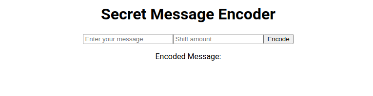
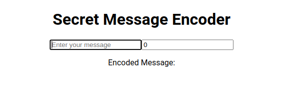
Next, add a few basic elements for input and a place to display the encoded secret message:
import React from 'react';
import logo from './logo.svg';
import './App.css';

function App() {
  return (
    <div className="App">
      <h1>Secret Message Encoder</h1>
      <div>
        <input
          type="text"
          placeholder="Enter your message"
        />
        <input
          type="number"
          placeholder="Shift amount"
        />
        <button >Encode</button>
        <p>Encoded Message: </p>
      </div>
  </div>
  );
}

export default App;
Save the file and watch the page update:
However, by themselves, these elements do nothing yet. We have to write code: variables, and functions, to make interesting interactions. In React it is common to use “state hooks” to keep track of values from HTML input elements and other sources. Since we have the message input and secret message output to keep track of, we will look at how to use these “state hooks” next.
React state hooks
State hooks in React are a feature that allows you to add state to functional components. In simpler terms, they let you keep track of data or variables that can change over time within your component. For functional components (components defined as a function) you have to use the useState hook to add state to your component.
When you call the useState function, you pass the initial state. Then the useState function will return a pair: the current state and a function that lets you update the state.
For example: const [message, setMessage] = useState('');.
Explanation:
useState(''): sets the initial value ofmessageto an empty string''message: is the variable with the value representing the current state.setMessage: this is the function you use to update themessagevalue.
Using state hooks with input elements turns them into controlled components. This means React controls the input element’s value. As a result, this allows predictable data flow and easier integration with other UI elements.
Adding state hooks to your first web app
Here we will add state hooks to the app and see how we can use this in practice. This will allow us to get the state of the input message, use it in a function to encode it, and then display the encoded message on the page.
Update Imports
Before we can use the useState function in our code we have to import it from the react library. While we’re at it let’s get rid of the logo.svg import on line 2:
import React, { useState } from 'react';
import './App.css';
We need to track the state for:
- input message
- shift value
- encoded message
Add state variables and functions
So let’s add the states for these values. For readability, these state declarations are usually placed at the top of the component function. In this case, for the App() function:
import React, { useState } from 'react';
import './App.css';

function App() {
  const [message, setMessage] = useState('');
  const [shift, setShift] = useState(0);
  const [encodedMessage, setEncodedMessage] = useState('');

  return (
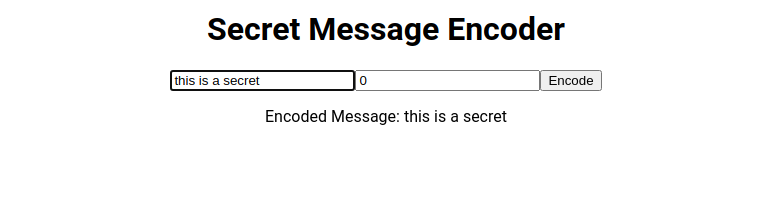
Next, update the elements to hook into this state. For now, let’s use the state of message to display changing values in the input element:
return (
    <div className="App">
      <h1>Secret Message Encoder</h1>
      <div>
        <input
          type="text"
          value={message}
          onChange={(e) => setMessage(e.target.value)}
          placeholder="Enter your message"
        />
        <input
          type="number"
          value={shift}
          onChange={(e) => setShift(parseInt(e.target.value, 10))}
          placeholder="Shift amount"
        />
        <button >Encode</button>
        <p>Encoded Message: {message}</p>
      </div>
  </div>
);
On line 15, the value of the input element is set to message. Then on line 16, the onChange attribute is set to call an event handler function. In React, onChange is used to update the state whenever the user types something into the input field.
The event handler function is declared using “arrow function syntax”: (e) => setMessage(e.target.value). This is a concise way to define a function in JavaScript.
- Event Parameter (
e): Theein the function represents the event object that is passed to the function when the input value changes. e.target.value:e.targetrefers to the element that triggered the event. In this case, the input element.e.target.valueis the current value of the input element. In other words, what the user has just typed or changed.
setMessageFunction:setMessageis a function generated from theuseStatehook you declared earlier. As mentioned, it’s used to update the state variablemessage.- When the user types in the input field,
setMessage(e.target.value)updates themessagestate with the new value.
There is similar code for the number input on lines 21 and 22. However, here we have to parse the string into a number (integer in this case) to be able to use the input as a number in other parts of the code.
Finally, on line 26 we use the message state again to display it.
Now when you save these changes and type something into the text field, you should see the text also change after the “Encoded Message: ” text:
Code for encoding the message
To finish this part of the app we have to write a function to encode the message and display the encoded message instead of the normal message on the page.
Under the state variable declarations add a function:
const encodeMessage = () => {
    let result = '';
    for (let i = 0; i < message.length; i++) {
      let charCode = message.charCodeAt(i);
      if (charCode >= 65 && charCode <= 90) {
        // For uppercase letters
        result += String.fromCharCode(((charCode - 65 + shift) % 26) + 65);
      } else if (charCode >= 97 && charCode <= 122) {
        // For lowercase letters
        result += String.fromCharCode(((charCode - 97 + shift) % 26) + 97);
      } else {
        result += message[i];
      }
    }
    setEncodedMessage(result);
  };
const encodeMessage = () => { ... }: This defines a function named encodeMessage using arrow function syntax. The function encodeMessage is declared with const to indicate that the variable encodeMessage should not be reassigned to a different value or function later in the code. In JavaScript and especially in modern JavaScript development practices, functions that are not meant to be redefined are often declared as constants.
EncodeMessage function contents
The structure of the function is as follows:
- Initial Variables:
let result = '';: Initializes an empty string,result, which will be used to build the encoded message.
- Looping Through the Message:
for (let i = 0; i < message.length; i++) { ... }: This loop iterates over each character in themessagestring.
- Character Encoding:
- Inside the loop, each character’s ASCII code is obtained using
message.charCodeAt(i). - There is a conditional
ifon line 13, that checks to see if the currentcharCodeis an uppercase letter. If not uppercase, there is another check on line 16 to see if it is lowercase. If that check also fails it means that thecharCodeis not a letter. So it could be a number or special symbol instead. - Uppercase Letters:
if (charCode >= 65 && charCode <= 90) { ... }: This condition checks if the character is an uppercase letter (A-Z in ASCII).result += String.fromCharCode(((charCode - 65 + shift) % 26) + 65);: The character is shifted by theshiftvalue. The% 26ensures it wraps around the alphabet, and+ 65adjusts it back to the uppercase ASCII range.
- Lowercase Letters:
else if (charCode >= 97 && charCode <= 122) { ... }: This checks if the character is a lowercase letter (a-z in ASCII).- Similar to uppercase, the character is shifted within the lowercase ASCII range.
- Non-Alphabetic Characters:
else { result += message[i]; }: Any character that’s not a letter is added toresultwithout any change.
- Inside the loop, each character’s ASCII code is obtained using
- Updating the Encoded Message:
setEncodedMessage(result);: After the loop, theresult(now containing the encoded message) is used to update the state variableencodedMessagethrough thesetEncodedMessagefunction.
Using encodeMessage and displaying the result
Finally, you will update the code for the button to call the encodeMessage function and display the resulting encodedMessage state instead of message:
import React, { useState } from 'react';
import './App.css';

function App() {
  const [message, setMessage] = useState('');
  const [shift, setShift] = useState(0);
  const [encodedMessage, setEncodedMessage] = useState('');

  const encodeMessage = () => {
    let result = '';
    for (let i = 0; i < message.length; i++) {
      let charCode = message.charCodeAt(i);
      if (charCode >= 65 && charCode <= 90) {
        // For uppercase letters
        result += String.fromCharCode(((charCode - 65 + shift) % 26) + 65);
      } else if (charCode >= 97 && charCode <= 122) {
        // For lowercase letters
        result += String.fromCharCode(((charCode - 97 + shift) % 26) + 97);
      } else {
        result += message[i];
      }
    }
    setEncodedMessage(result);
  };

  return (
    <div className="App">
      <h1>Secret Message Encoder</h1>
      <div>
        <input
          type="text"
          value={message}
          onChange={(e) => setMessage(e.target.value)}
          placeholder="Enter your message"
        />
        <input
          type="number"
          value={shift}
          onChange={(e) => setShift(parseInt(e.target.value, 10))}
          placeholder="Shift amount"
        />
        <button onClick={encodeMessage}>Encode</button>
        <p>Encoded Message: {encodedMessage}</p>
      </div>
  </div>
  );
}

export default App;
The only lines changed here are lines 42 and 43.
On line 42, we added the onClick attribute. Setting this attribute will let the app execute code whenever the user clicks on the button. In this case, the encodeMessage function will be called.
Lastly, on line 43, the message variable was replaced by encodedMessage to show the encoded message.
Now save and run the app. Then type a message, make sure to change the number value in the input box next to the “encode” button, and press the Encode button. A secret message should appear:
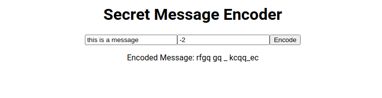
In this case, the number value is -2, if the number is 0 then the message will stay unchanged.
Creating a message encoder component
A typical React application is built up out of components. Currently, the application only has the App component. If you want to create more functionality for your first React Web App, you could put all the code and elements in the App component in App.tsx. However, this method of working is going to become very messy quickly. Breaking your code up into smaller components helps prevent clutter and unmanageable code.
Creating a component means writing self-contained code. As a result, the component becomes easy to reuse. For example, you may want to reuse the message encoder on other pages of your app as well. Simply copying the code can cause headaches. Imagine a situation where you want to change the message encoding function. As a result of having copied the code to a different page, you now have to update the code for encoding in two places.
Add EncoderForm.tsx
Start by adding a new file to the src directory called EncoderForm.tsx:
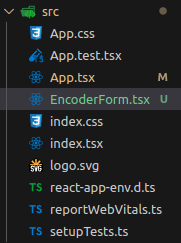
Now add the following code to this empty EncoderForm.tsx file. The code is very similar to the code you already wrote in App.tsx with some small differences:
import React, { useState } from "react";

function EncoderForm() {
  const [message, setMessage] = useState("");
  const [shift, setShift] = useState(0);
  const [encodedMessage, setEncodedMessage] = useState('');

  const encodeMessage = () => {
    let result = "";
    for (let i = 0; i < message.length; i++) {
      let charCode = message.charCodeAt(i);
      if (charCode >= 65 && charCode <= 90) {
        result += String.fromCharCode(((charCode - 65 + shift) % 26) + 65);
      } else if (charCode >= 97 && charCode <= 122) {
        result += String.fromCharCode(((charCode - 97 + shift) % 26) + 97);
      } else {
        result += message[i];
      }
    }
    setEncodedMessage(result);
  };

  return (
    <div>
        <input
          type="text"
          value={message}
          onChange={(e) => setMessage(e.target.value)}
          placeholder="Enter your message"
        />
        <input
          type="number"
          value={shift}
          onChange={(e) => setShift(parseInt(e.target.value, 10))}
          placeholder="Shift amount"
        />
        <button onClick={encodeMessage}>Encode</button>
        <p>Encoded Message: {encodedMessage}</p>
      </div>
  );
}

export default EncoderForm;
The name of the component is different of course. And the <h1> tag is not included here.
Then can update the App.tsx file like this:
import React, { useState } from "react";
import "./App.css";
import EncoderForm from "./EncoderForm";

function App() {
  return (
    <div className="App">
      <h1>Secret Message Encoder</h1>
      <EncoderForm></EncoderForm>
    </div>
  );
}

export default App;
Here you can see the EncoderForm component is imported on line 3 and used on line 9. Saving and running the app results in the exact same behavior as before. However, now you can easily include the encoder form component on any page you want.
However, the encoded message will always be displayed in the same way with this component. What if don’t want to display the encoded message on the page and instead want to save it or send it somewhere?
Let’s modify the component so it returns the encoded message to a handler function. This handler function can be declared by the page that uses the EncoderForm component.
Making the EncoderForm component more dynamic
In this section, you will learn the basics of component properties or props. And then you will update the EncoderForm component to use props to be more reusable.
Component props in React are a way to pass data and functionality between components. They are similar to function arguments and allow components to be more dynamic and reusable. Because props allow components to work with dynamic inputs the behavior of the component can change. For example, you can have properties for hiding certain elements of the component. Or change the data it is displaying, influence how the data is displayed, etc.
The properties are usually defined with an interface. For example, interface EncoderFormProps {}.
Updating the EncoderForm to have a property
First, declare an interface that defines the property. Then we can remove the encodedMessage state-related code because we will pass the result of the encodedMessage function out to the property:
import React, { useState } from "react";

interface EncoderFormProps {
  onEncode: (encodedMessage: string) => void;
}

function EncoderForm({ onEncode }: EncoderFormProps) {
  const [message, setMessage] = useState("");
  const [shift, setShift] = useState(0);

  const encodeMessage = () => {
    let result = "";
    for (let i = 0; i < message.length; i++) {
      let charCode = message.charCodeAt(i);
      if (charCode >= 65 && charCode <= 90) {
        result += String.fromCharCode(((charCode - 65 + shift) % 26) + 65);
      } else if (charCode >= 97 && charCode <= 122) {
        result += String.fromCharCode(((charCode - 97 + shift) % 26) + 97);
      } else {
        result += message[i];
      }
    }
    onEncode(result);
  };

  return (
    <div>
      <input
        type="text"
        value={message}
        onChange={(e) => setMessage(e.target.value)}
        placeholder="Enter your message"
      />
      <input
        type="number"
        value={shift}
        onChange={(e) => setShift(parseInt(e.target.value, 10))}
        placeholder="Shift amount"
      />
      <button onClick={encodeMessage}>Encode</button>
    </div>
  );
}

export default EncoderForm;
The property is declared on lines 3 to 5. This interface defines the shape of the props that EncoderForm expects. In this case, it expects a property called onEncode that is defined as a function that takes a single string argument (encodedMessage) and returns nothing => void.
Then on line 7, the EncoderForm component definition is updated to use this property interface. { onEncode }: This is an example of destructuring. It extracts the onEncode function from the props object. This way, inside the component, you can directly use onEncode instead of props.onEncode.
Finally, instead of setting encodedMessage state we call the function passed through the props with the result of the message encoding process on line 23.
Update App.tsx with a handleEncode function
Before you run the application you have to update App.tsx as well. Because the definition of EncoderForm has changed, the property onEncode is required. You will get an error unless you update it:
import React, { useState } from 'react';
import EncoderForm from './EncoderForm'; // Import the new component
import './App.css';

function App() {
  const [encodedMessage, setEncodedMessage] = useState('');

  const handleEncode = (encoded: string) => {
    console.log(`encoded message: ${encoded}`);
    setEncodedMessage(encoded);
  };

  return (
    <div className="App">
      <h1>Secret Message Encoder</h1>
      <EncoderForm onEncode={handleEncode} />
      <p>Encoded Message: {encodedMessage}</p>
    </div>
  );
}

export default App;
In this updated code we have a function handleEncode which is the function that is passed to our component and will be used by the component when the message is encoded. This function has to have a string parameter so it matches the expected function signature as defined by the property. The handleEncode function prints the encoded message to the debug console using console.log. You can view the console in your browser in “developer tools”. And the function sets the encodedMessage state.
On line 16, the EncoderForm is updated with the onEncode property to pass in the handleEncode function. Make sure to not use () after the function name. Otherwise, this would be calling the function instead of passing it.
If you run the application now, there should be no change to the functionality.
Use useEffect to react to changing values
The current application only encodes the message after a user presses the encode button. But what if we wanted to encode the message in real-time, at the same time the user types a message or changes the number for the “shift” input? You can do that using useEffect function.
There are several ways you can use useEffect:
- On Mount: this means that when the component is loaded onto the page for the first time the effect will run once.
useEffect(() => {
  // Code to run on component mount
}, []); // Empty dependency array
- When a value changes: so the effect will execute when a value is changed using its
useStatefunction.
useEffect(() => {
  // Code to run when dependencies change
}, [dependency1, dependency2]); // Dependency array
- Every time something rerenders: the effect will execute whenever something changes. This could be useful when you want to react to all changes in a component. However, it is not often used because it could cause performance issues.
useEffect(() => {
  // Code to run after every render
});
Write to the console when a component loads with useEffect
First, let’s create a simple useEffect function in your first React web app for when the component is mounted. In other words, when the component loads on the page. Open the EncoderForm.tsx file and add the highlighted code below the useState declarations:
function EncoderForm({ onEncode }: EncoderFormProps) {
  const [message, setMessage] = useState("");
  const [shift, setShift] = useState(0);

  useEffect(() => {
    console.log("Encoder form loaded");
  }, [])
Now, every time the page loads we should see this message in the developer tools console of the browser:
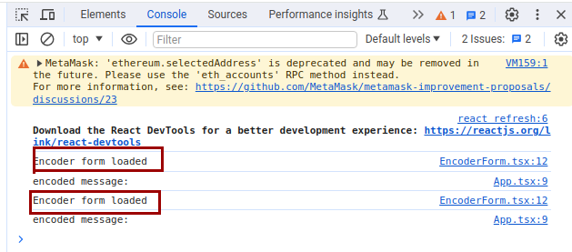
Because the application is running in Dev mode the message appears twice. In a later section, this useEffect function will be used to set focus to an input element.
Real-time secret updating with useEffect
Update the EncoderForm.tsx code by adding a useEffect function. And since the secret message will be updated automatically by useEffect the encode button is no longer needed. So, let’s remove the button:
import React, { useEffect, useState } from "react";

interface EncoderFormProps {
  onEncode: (encodedMessage: string) => void;
}

function EncoderForm({ onEncode }: EncoderFormProps) {
  const [message, setMessage] = useState("");
  const [shift, setShift] = useState(0);

  useEffect(() => {
    console.log("Encoder form loaded");
  }, [])

  const encodeMessage = (msg: string, shiftBy: number) => {
    let result = "";
    for (let i = 0; i < msg.length; i++) {
      let charCode = msg.charCodeAt(i);
      if (charCode >= 65 && charCode <= 90) {
        result += String.fromCharCode(((charCode - 65 + shiftBy) % 26) + 65);
      } else if (charCode >= 97 && charCode <= 122) {
        result += String.fromCharCode(((charCode - 97 + shiftBy) % 26) + 97);
      } else {
        result += message[i];
      }
    }
    onEncode(result);
  };

  useEffect(() => {
    encodeMessage(message, shift);

  }, [message, shift]);

  return (
    <div>
      <input
        type="text"
        value={message}
        onChange={(e) => setMessage(e.target.value)}
        placeholder="Enter your message"
      />
      <input
        type="number"
        value={shift}
        onChange={(e) => setShift(parseInt(e.target.value, 10))}
        placeholder="Shift amount"
      />

    </div>
  );
}

export default EncoderForm;
Now when you type in the message box or change the numbers in the shift input element the secret message is updated right away.
Get a reference to an element with useRef
useRef is a hook in React that returns a mutable ref object whose .current property is initialized to the passed argument. The returned object will persist for the full lifetime of the component. useRef is commonly used for a few different purposes:
- Accessing DOM Elements: You can use
useRefto directly interact with a DOM node, like focusing an input or measuring its size. - Storing a Mutable Value: Unlike state, changing the
.currentproperty doesn’t cause the component to re-render. It’s like having a “private” variable for a component that can hold a mutable value that doesn’t trigger re-renders when changed. - Preserving Data Across Renders: Data stored in
useRefwill be preserved across renders, making it useful for keeping track of things like timers or previous state values without causing additional renders.
Set the focus on the message input field with useRef
In this section, you will create a useRef example for this first React app. In this case, the code you will create is going to set the “focus” on the message input element when the component first loads. To put it another way, the input field activates and becomes ready for typing as the page loads. Because currently, a user has to first click in the input box to be able to type into it.
Here is the first part of the code with the updates to use useRef:
import React, { useEffect, useRef, useState } from "react";

interface EncoderFormProps {
  onEncode: (encodedMessage: string) => void;
}

function EncoderForm({ onEncode }: EncoderFormProps) {
  const [message, setMessage] = useState("");
  const [shift, setShift] = useState(0);
  const inputRef = useRef<HTMLInputElement>(null);

  useEffect(() => {
    console.log("Encoder form loaded");
    if(inputRef?.current) {
      inputRef.current.focus();
    }
  }, [])
First, you update the import on line 1 to import useRef. Then declare a variable that is going to store the reference on line 10. We want to make it a reference to a input element so we make the type <HTMLInputElement>.
Next, code to set the focus on the reference to the input element is called on line 15. The if statement checks if there is a current reference. This is to make sure you don’t get errors when you call focus().
Finally, you need to connect the input element to the reference:
 <input
    type="text"
    value={message}
    ref={inputRef}
    onChange={(e) => setMessage(e.target.value)}
    placeholder="Enter your message"
  />
Now when you refresh the page, the input box for the message should instantly get the focus and become active:
Conclusion
In this tutorial, you have learned how to create your first React Web App. You know how to create a React project, and you have an understanding of all the files that make up a React project. Furthermore, you have built a small Web App using important React concepts like components, useState, useEffect, and useRef.
Whether you’re aiming to become a professional React developer or simply exploring it as a hobby, the skills you’ve acquired here will serve as a solid foundation for your future endeavors in the world of web development. Keep learning, keep coding, and most importantly, enjoy the journey.
If you want to learn how to use this knowledge to create a simple full stack web app this other tutorial will be good to follow here: Python and React Web App for beginners
Please follow me on X for more programming tutorials:
Follow @tmdev82